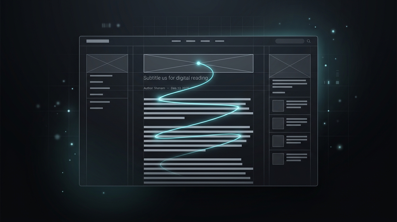
Many marketers believe that "UX Design" only applies to mobile apps or SaaS dashboards. Critical mistake. The user experience on a blog article is the deciding factor between an immediate bounce and a deep 5-minute read.
Typography as a Conversion Tool
Good design is invisible; you don't realize it's there, you just feel that reading is a pleasure. Golden rules for content:
- Line-Height: It must be at least 1.5x or 1.6x the font size. Tight text causes instant visual fatigue.
- Container Width (Line Length): The human eye tires if it reads more than 70-80 characters per line. Blogs that span 100% of the monitor's width are killing their retention.
- Hierarchy (H2 and H3): Internet users don't read, they scan. Your header structure must be able to tell the story on its own.
Contrast and Negative Space
At ExpertosMKD, we use dark backgrounds with slate-300 and slate-400 typography. We do not use pure white (#FFFFFF) on pure black (#000000) because it causes a visual "halo effect" and fatigues astigmatics. All this UX effort has one single commercial goal: For you to consume our content without friction, trust our technical authority, and become a client.
#UX#Tipografía#CRO#Legibilidad
Share this insight:
Isabella C.
Lead UI/UX Designer